Limelight is a live streaming app for performing artists. One of the primary mission statements for the company is to introduce additional revenue streams to musicians.
Limelight Music Inc.
4 weeks
UX designer
Research
Prototype
Usability testing
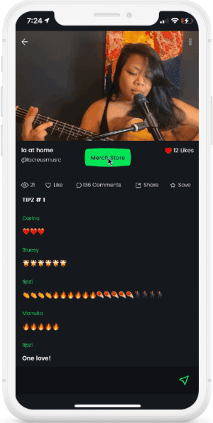
In order make additional revenue, artists need to engage with fans by selling merchandise (merch). Fans need the ability to purchase merch without disrupting the flow of the livestream.
I first did research to understand the value of artists selling merchandise. Then I designed and tested a prototype.
I began with a venn diagram in order to compare live streaming and in-person concerts. I discovered that selling merch could be a good feature to develope but I would need to do further research in order to find out the value.

I interviewed a touring manager for a live band and read several articles in order to discover the value of selling merch. I gained confidence that a merch store would be a valuable feature to design.


As it became clear to me that a merch store is an important revenue stream for artists, I unpacked some other reasons why it can be of value. Selling merch helps artists to engage with fans, who then exhibit the artist’s name, promoting growth in popularity for the artist. I put all of the research together in an affinity map to construct a model to design upon.

In order to better understand the process of setting up a merch store first hand, I experimented with a few manufacturing companies and online stores. I gathered reasearch from different companies to find out which would be a good model to incorperate into the process of designing a merch store feature.


• Diverse clothing
• Complex UI
• Diverse items
• Simple UI
• 5 products free
• Simple UI
• No free plan
• Inaccessable UI

I was originally going to base my merch store feature on a combination of Printful and Big Cartel, which integrate well together. I discovered another company, Everpress, that offered a unique model that I would adopt into my design because of the following points:

• Short campaigns — Great for livestreaming shows
• Fully integrated manufacturing company and store
• Less, but better — Indie company with great ethics
The process of selling merch online poses several challenges. It requires the artist to understand how to navigate complex websites. In order to facilitate the process for the user, I began with a conceptual model in which the Limelight app would take care of the complicated process in order to create a simple and straight forward approach for artists to sell merch within the app.

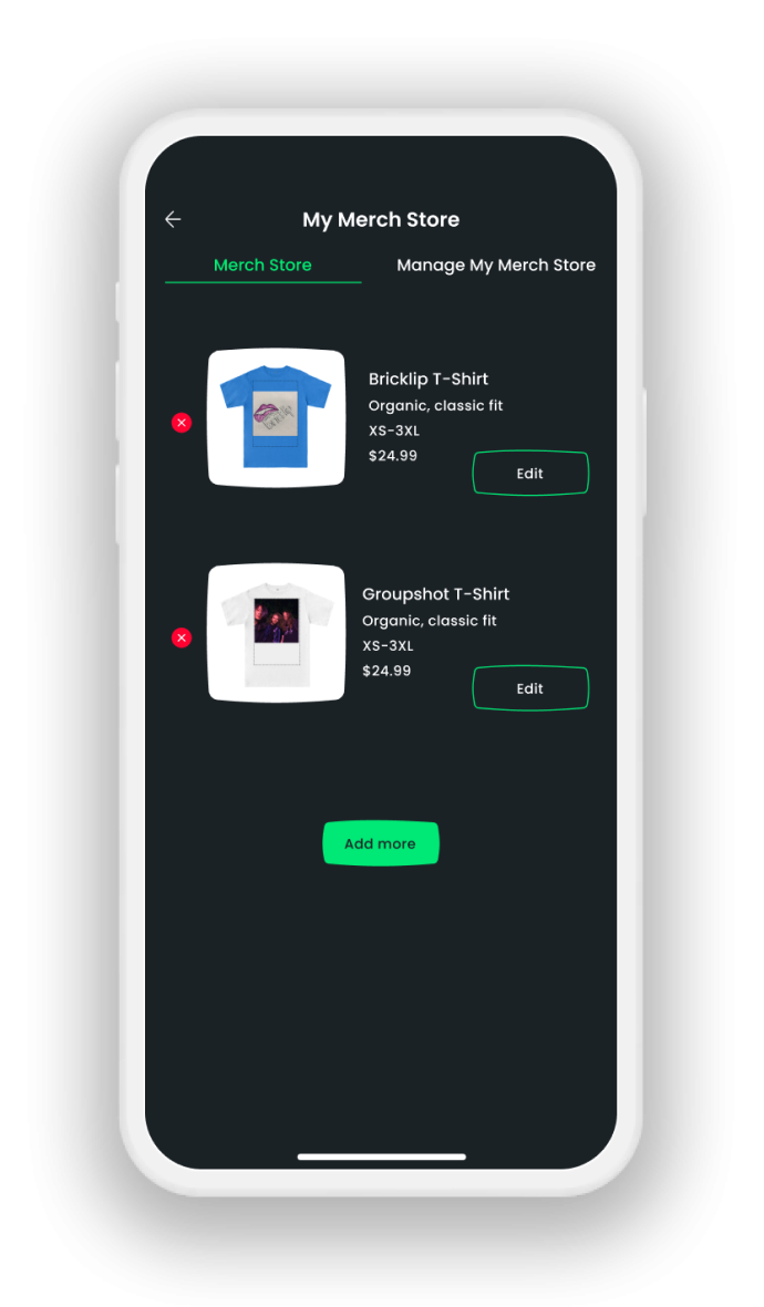
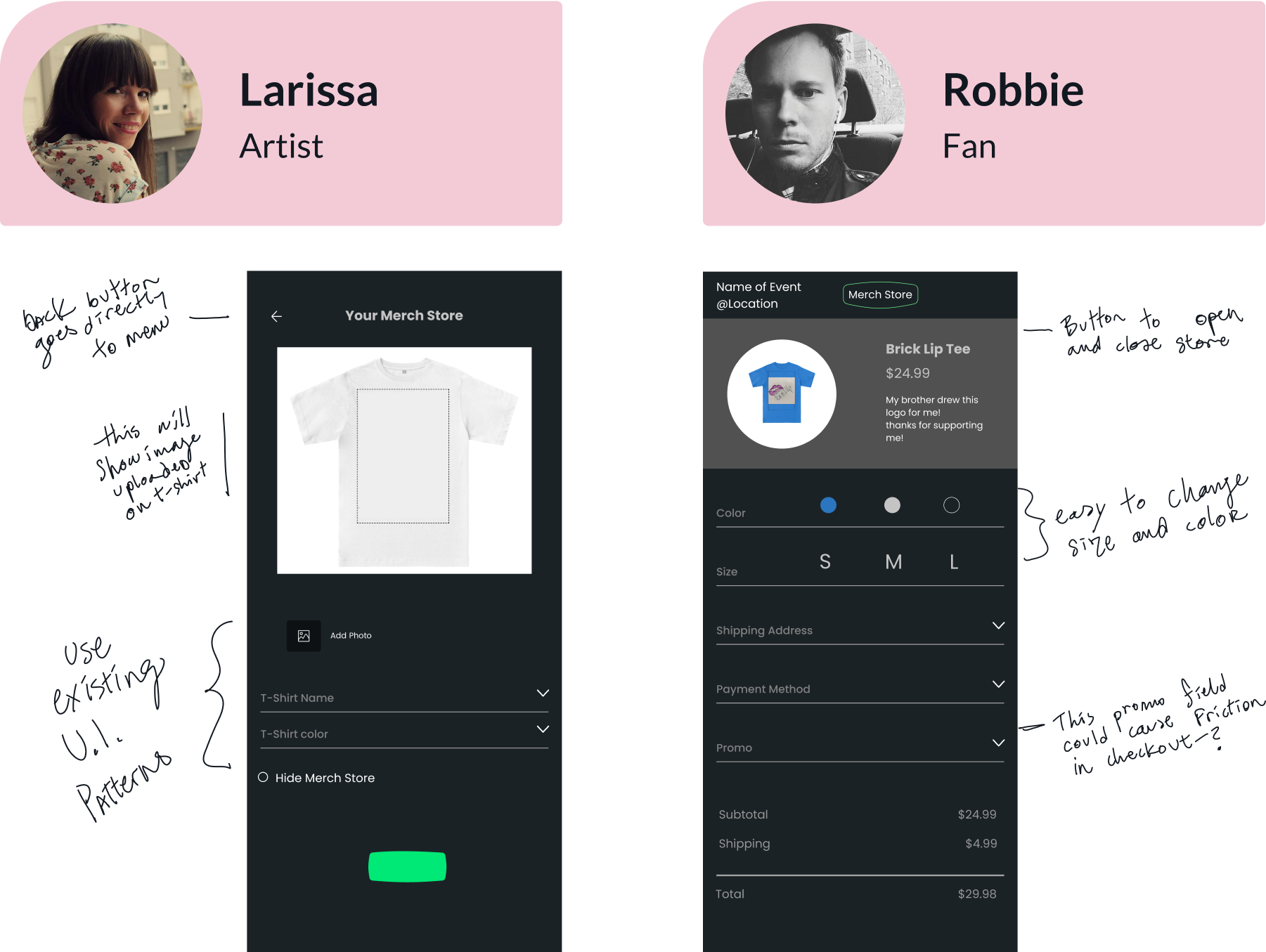
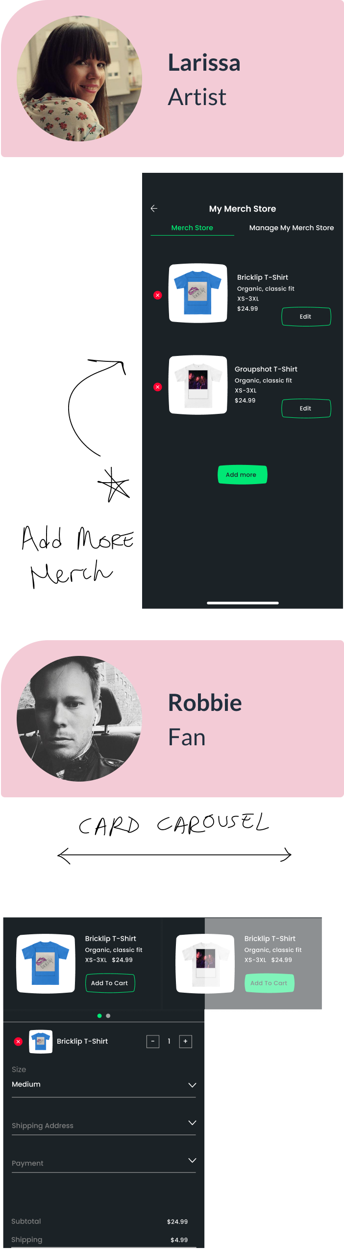
In order to better understand users of the Limelight app, I spoke to the stakeholder to gather data about the different user roles within the app. I created personas to represent the different user needs. This helped me to understand that I would create separate designs for each user.


I created a user flow to get a better understanding of which pages I would need to design for the merch store feature based on user needs.


I created wireframes and quickly made a lofi prototype that I could test, to ensure I was not missing any significant parts in the design. I kept existing UI patterns from the Limelight app in order to stay consistent.

I did several rounds of usability testing at each point in the design process in order to find any major issues as early as possible. I found this iterative testing process was possible because the users were available and excited to meet frequently.


User wants to add more merch and colors.
How can I make the user feel like they have more options in a limited design?
I decided to allow Artists to upload more than one t-shirt and chose colors. The Fans would then have less choices to make.
Confusing UX at checkout screen
How the ‘New address” input be more clear?
Removal of excess labels. Make all labels able to tap and change with consistent patterns from common app designs.
It was much easier for the user to create a second item after they had already learned how to create the first.
How could I improve upon learnability?
Reiterate on specific user flow to create a more simple design.
I continued to improve upon in the design.

After several iterations, I created a hifi prototype that I could use for a more extensive round of usability testing.


Casey was enthusiastic to learn and study the product and company goals. He created a well designed feature to enhance our mission! We will be implementing his designs in upcoming builds. He was a pleasure to work with and delivered above expectations. Looking forward to be working with him again in the future.
If I had more time to work on this project, I would continue to test and refine the design. I would also work on improving accessibility. At times I found it challenging to maintain a balance between client and user needs. It was helpful to work with a persona in order to get ideas across. Usability testing offered the most significant feedback.
In this project I learned how to discover and fulfill a valuable need for this company. I presented the final project with the company board members who were very enthusiastic about the idea. In the future, I would be in closer communication with all members of the company, throughout the iteration process, in order to fully understand and grasp all of their needs more completely.