Project Canopy, a non-profit organization from Switzerland, found a way to use data science to save the rainforest in the Congo Basin. The company’s goal is to disrupt the climate change by using new technology to inform the organizations involved.
Project Canopy
4 weeks
UX designer
Research
UX design
UI design
Project Canopy needed a prototype in order to to show potential investors. The desktop app would allow decision makers to better allocate funding in order to reduce deforestation and help global climate change.
I created a desktop app for Project Canopy based on all of the primary research I had gathered from the co-founders. I also created a design system to carry on into the next phase of development.
By interviewing the co-founders, I was able to understand their vision of the Project Canopy app. I unpacked their goals in designing a product that would utilize innovative technology in a practical way. One of the primary issues is the regulation of logging roads, which people currently discover by riding around on motorcycles. The app will address this issue by significantly reducing the amount of time it takes to discover new logging roads.
I met with Project Canopy’s team of data scientists who shared their breakthrough results in creating a machine learning algorithm that accurately discovers logging roads in the rainforest of the Congo Basin rainforest. This model would be one of the main functions of the app.

The Project Canopy team provided me with a mockup of their initial vision of the app. Phase one of the Project Canopy app will showcase the innovative technology and leave room for future developement once more funding comes in.

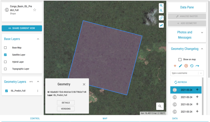
This is the current working model that Project Canopy is using to showcase the logging roads tracker technology. There are some fundamental issues including complex parameters and unnecessary information available to users.
In order to create the best design, I came back to some of the fundamental design principles.
• Create limitations for users
• Intuitive patterns from common apps
• Simplistic design
Together with the co-founders, we came up with the most important questions to answer through the new design. We kept referring back to these questions throughout the design process. The following flow chart takes on the perspective of the user and their needs.


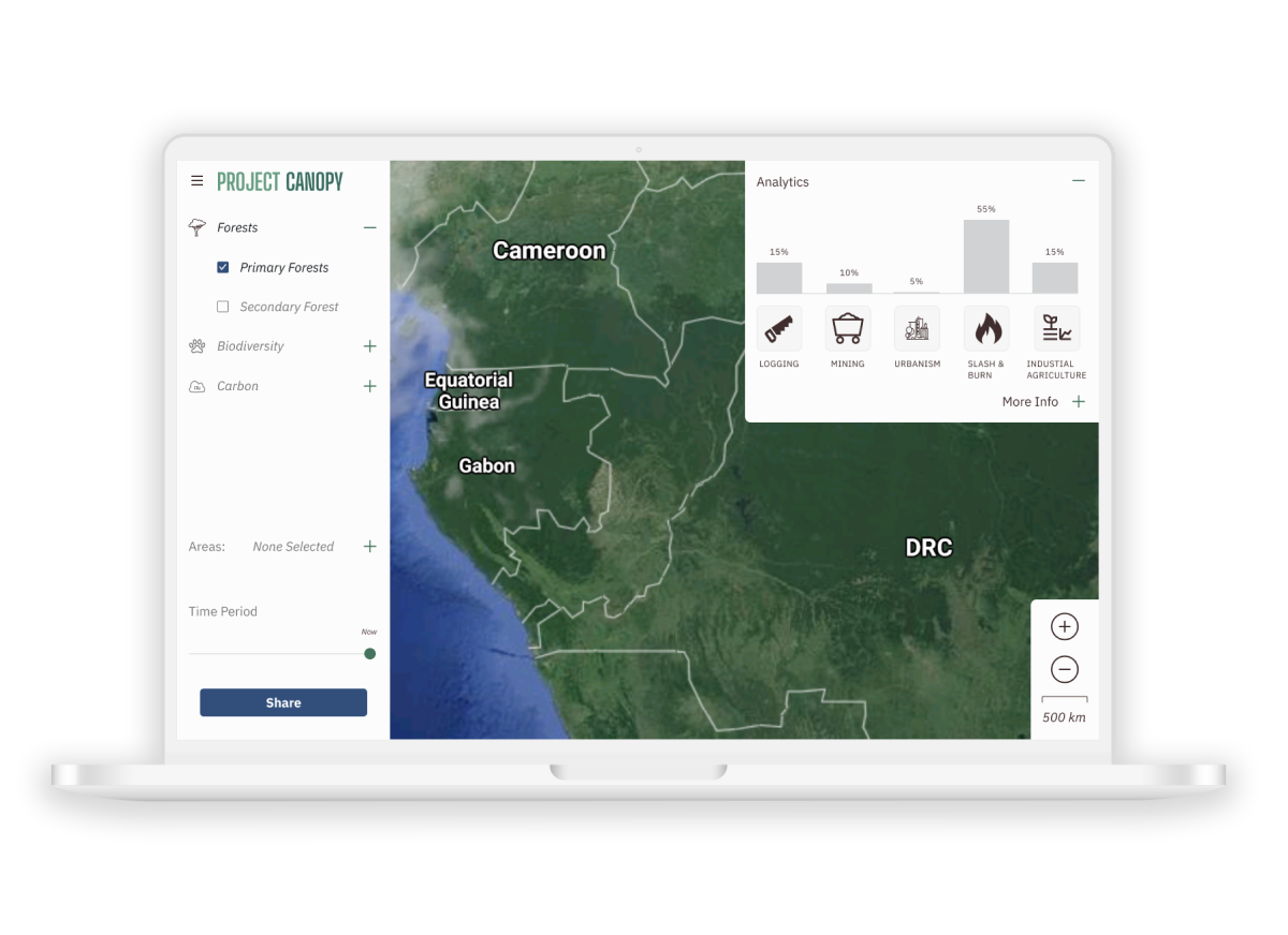
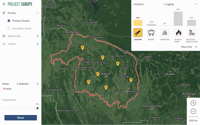
The first step is to let the user know where the different ecology exists in the Congo Basin rainforest using a map and to define an area. The next most important question to answer for the users is what kinds of drivers are affecting these areas. There should be space for analytics on the map.
I created a sitemap for the key components in the Project Canopy app design. This way I knew which parts to build before putting them all together.

I created a wireframe to organize the information architecture and figure out where the key components would be in the Project Canopy app.

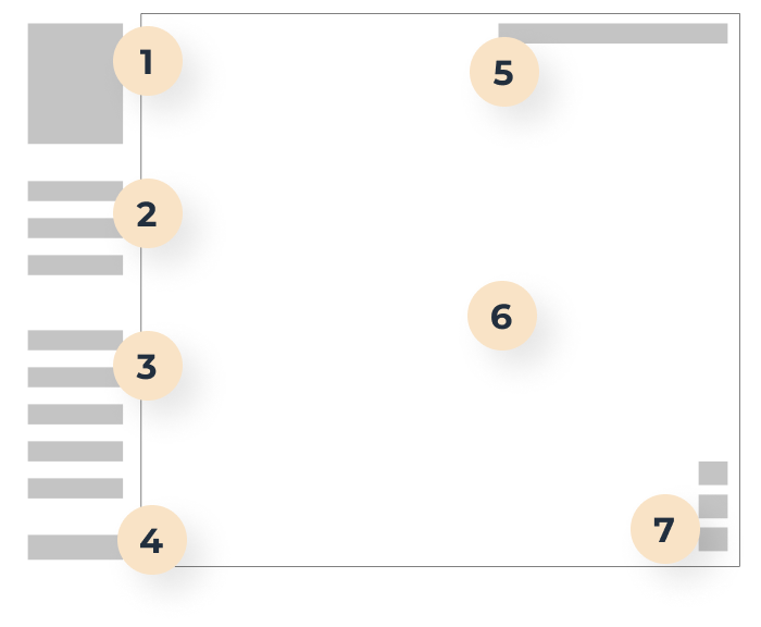
Based on my primary research I had a very good understanding of what the owners needed in their design. I created all of the individual components in order to fit them together as a whole.
The first interaction the user needs is to choose which ecology type will appear on the map. I used common patterns from industry standard websites.
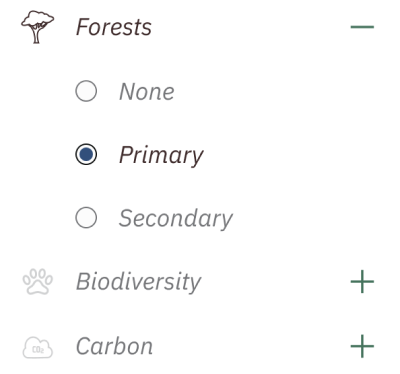
There are several areas to choose from. The challenge here was to present all of the areas while maintaining a minimal amount of space. I used this common pattern from other non-profit websites to reduce the learning curve for users.

Users have options to share the area they have defined. People on the ground need to have the capability of retrieving GPS coordinates in order to find a location in real time.

Based on my primary research I had a very good understanding of what the owners wanted in their design. I created all of the individual components in order to fit them together as a whole.
The first interaction the user has is choosing which ecology type will appear on the map. It was important to use common patterns from industry standard websites.
There are a lot of areas to choose from. The challenge here was to use a pattern that would allow the drop down menu to present all of the areas while maintaining a minimal amount of space. I used a common pattern from other non-profit websites to reduce the learning curve for users.
Users have options to share the area they defined. People on the ground need to have the capability of retrieving GPS coordinates in order to find a location in real time.
The primary language of many of the users is French, however, it remained important to keep an English version. Being a bilingual person myself, I was able to translate the app into both languages. I had to account for extra spacing because of the longer French words.
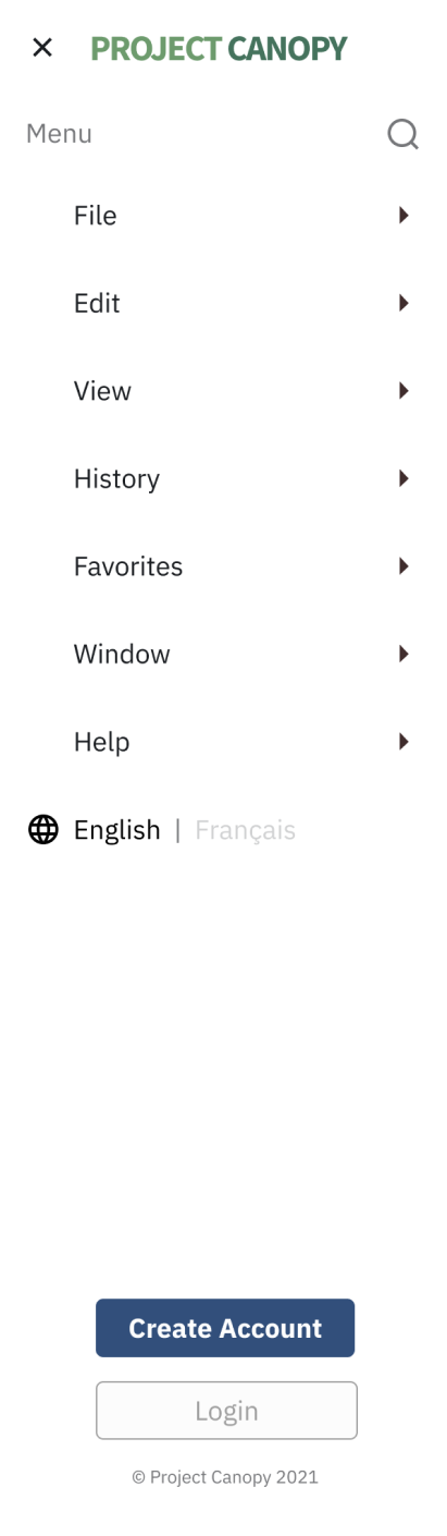
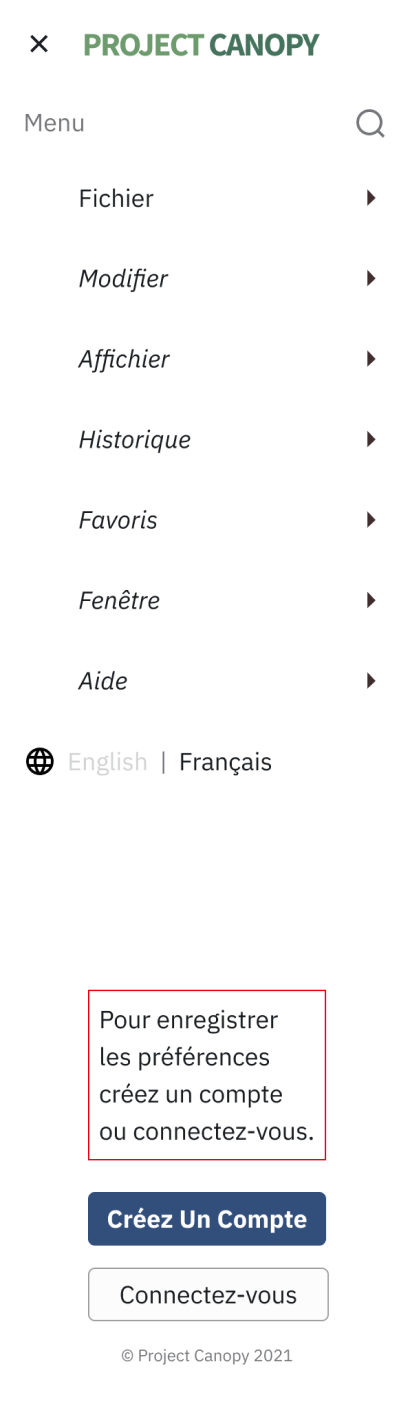
The primary language of many of the users is French, however, as English is a global language, it remained important to keep an English version. Being a bilingual person myself, I was able to translate the app into both languages. I translated the app manually, as opposed to using a translator algorithm, in order to account for the French language often using longer words (and thus requiring a design modification.
I put all the individual components together in order to create a user flow based on all of the research so far. The user could be a project manager looking to manage and allocate funding in order to protect the rainforest, or it could be a person on the ground looking for new logging roads.
The user begins by opening the app and chosing an ecology type in the side panel.

The user designates an area they want to view on the map. When an area is chosen, the analytics component opens up to show the stats for the area.

The user can interact with the analytics by clicking specific features to view as another layer on the map.

The user can zoom in close to discover logging roads and share the information with their network or get GPS Coordinates to visit the roads first-hand.

I put all the individual components together in order to create a user flow of a use case based on all of the research so far. The user could be a project manager looking to manage and allocate funding in order to protect the rainforest, or it could be a person on the ground looking for new logging roads.
The user begins by opening the app and chosing an ecology type in the side panel.

The user designates an area they want to view on the map. When an area is chosen, the analytics component opens up to show the stats for the area.

The user can interact with the analytics by clicking specific features on the map to view as another layer.
The user can zoom in close to discover logging roads and share the information with their network or get GPS Coordinates to visit the roads first-hand.

The co-founders have been in the non-profit sector for 10+ years and shared feedback that they were very satisfied by the usefulness of the new Project Canopy app design. They have been able to use this model to show potential investors.

It's a real pleasure to work with Casey. He's patient, professional, curious, and knows what questions to ask. But, most importantly, by working with him we have learned even more about the organization we want to build. Thanks to Casey, we have an even better product than what we started out with.

Casey is exceptionally thoughtful and patient designer, and shows genuine interest in understanding what we are trying to accomplish as an organization.
With further funding and time I would be able to run a series of user testing in order to refine the app to user needs. As the data scientists continue their research and find ways to create analytics, these would be added to further development of the data visualization dashboard section in the app.
This project allowed me to design a desktop app from the vision of the co-founders. I learned to work quickly and non-destructively in order to provide iterations of each app component. It would have been nice to be able to do additional user research in order to uncover any blind spots within the project that the co-founders (of whom are subject matter experts) may have overlooked.